
Global Digital Marketing & Retail by Alex 11
Inspiration from across the world

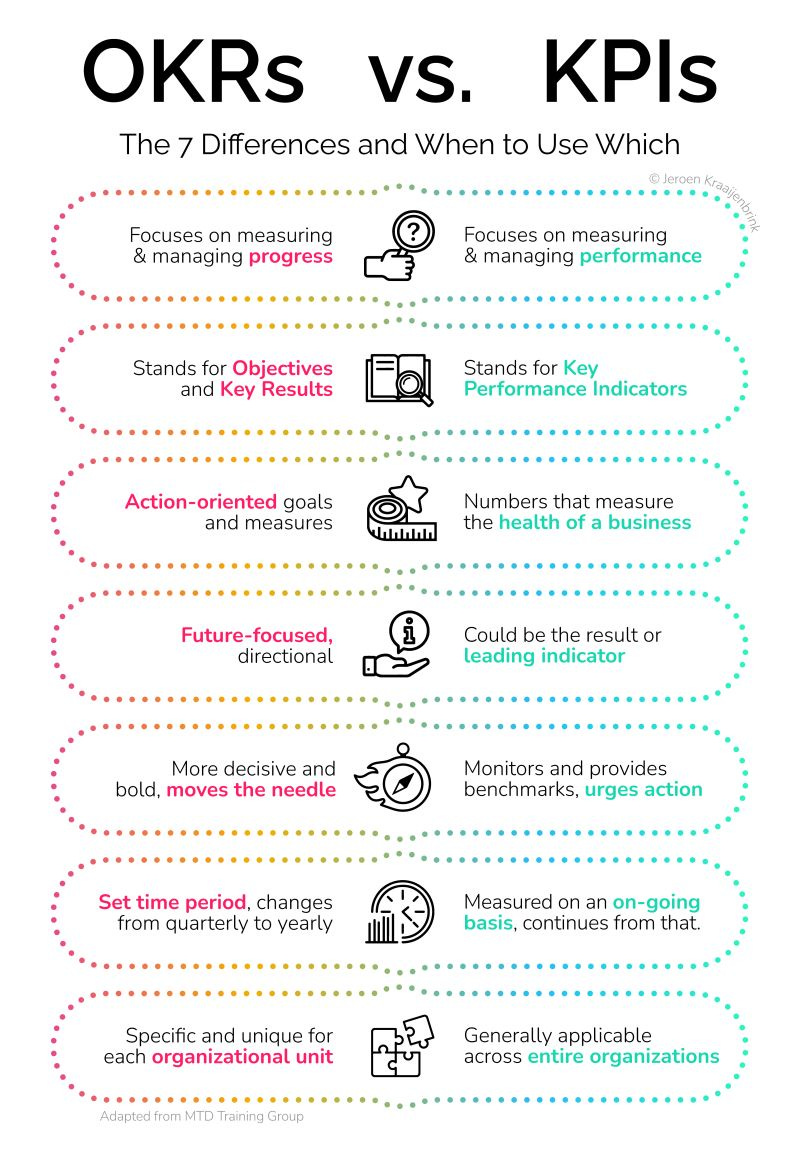
📈OKR’s: metric for international product development
Most companies use KPIs, but there are also OKRs. I tend to like OKR’s better. Simply because OKRs are used to measure and manage progress made with respect to achieving something specific. As such, they are more diverse, unique, and dynamic than KPIs.
Of course, OKRs and KPIs”s can co-exist. But I think this infographic can be useful for people who feel a little “stuck” in “annual KPIs”. Also, I think OKR’s work better in international product development:
OKRs are more flexible and adaptable to different cultures and markets
OKRs provide a better sense of direction and motivation for teams working across different time zones and cultures. KPIs can be seen as a set of targets to be met, but they can lack the overarching vision and purpose that OKRs provide.
OKRs foster a more collaborative and cross-functional approach to product development. OKRs are designed to be shared across different teams and functions, encouraging collaboration and cross-pollination of ideas.
OKRs are a better fit for international product development because they are more flexible, collaborative, motivating, and conducive to innovation.
🪄E-commerce professionals are like magicians
I read a report the other day that more or less cited this quote below. I liked it, so I generated an image via Midjourney v6 to go with it:
“As an e-commerce brand owner, you're like a magician, constantly working to make sure your customers don't see any of the strings behind the trick. That's why 80% of your time is spent smoothing out the wrinkles in the customer journey, removing any bumps or snags that could derail their shopping experience."

📀ERO: engagement rate optimization

As I wrote in my previous newsletter, for SEO-ers it is more and more important to focus on what is actually happening on a page. Today I found this model (below) that mentions ERO “Engagement rate optimization”, so what is it?
Say you have a page "best guitars for beginners" with a 10-minute YouTube video of you (the author) within the first 25% of the page explaining why the guitars on the page are the best.
The video has an engaging branded thumbnail that entices the click and because it is relevant to the page gets an average retention of 3-4 minutes (ERO), Google sees that there is a video on the page via schema (SEO) and throughout the video you have CTAs pushing the viewer to convert (CRO).
So what's the takeaway with all this? In 2024 it’s not enough to just be thinking about SEO and CRO. You have to be thinking about ERO and what elements you have on the page to stir engagement.
Also, think about the elements you already have (like a table of contents) and think if it could be made better and more engaging (don’t forget about mobile UX!) When you make a change look at pre and post-Hotjar heatmaps and session recordings alongside bounce rate changes (via GA4).

Source
🇨🇳 Dewu is so much more than just shopping
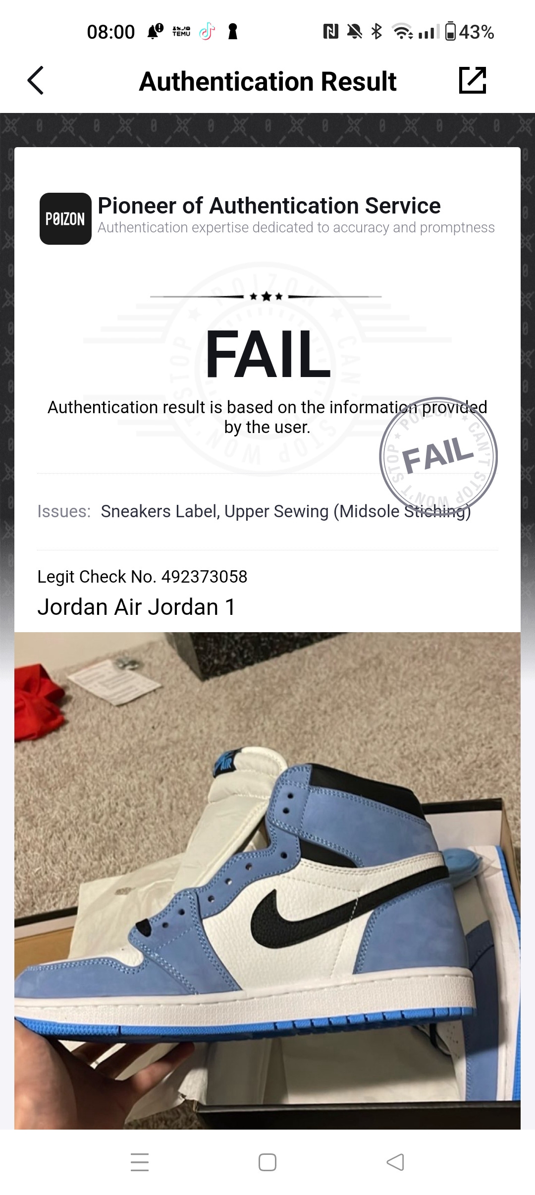
Dewu, or in English called Poizon is a Chinese platform that focuses on the authenticity of products. Important in a country where fake products are available everywhere.
Originally it focused a lot on individual travelers, who shopped abroad and sold their luxury goods on this platform. Great idea! Get part of your holiday spending back by trading when you are back home.
Because of travel restrictions (the pandemic and more), the platform is now becoming a B2C platform.
It’s worth following this platform, not only for the products they sell but also for their innovative features. I have always been very fond of companies that innovate on features to add value for their users. Dewu is so much more than just shopping, so many cool features are integrated, features that many apps in the west don’t have (yet). For example:
3D view and AR try-on effect
The products are linked to recent live streaming from KOLs (key opinion leaders)
Creators can get actual returns by publishing qualified video content, so nice to boost that discovery & inspiration flywheel
Experts give beauty tips and product reviews
Their authentication tool is really easy and convenient to use, making sure you get good items and you can also use it if you just want to verify a purchase you have done elsewhere
Dewu is also a platform to meet new people, it goes way beyond just shopping or authentication
Now the Western version of the app is quite limited, I gave it a try. You can do authentication of sneakers, watches, etc. So for that, you can use it, but that’s about it. They do have plans to expand abroad, hopefully with all features.
https://theedgemalaysia.com/node/694962
https://walkthechat.com/chinas-trendy-ecommerce-app-dewu-poizon-bets-on-video-content/
https://marketingtochina.com/dewu-poizon/
↪️Ugly Ads: opportunities for every brand (including luxury brands)
Do you know this feeling? You can make ads for the company you work for, but everything has to be “in line with the brand” or “verified by the branding department”, or designed as a marketer you are not even allowed to just create an ad.
So annoying often because it blocks quick testing and removes creativity. If you have that feeling also, or you just want to get some inspiration on creating simple, but effective ads, then listen to this podcast about “Ugly Ads”. Lots of examples and straightforward marketing that can take place next to your regular marketing.
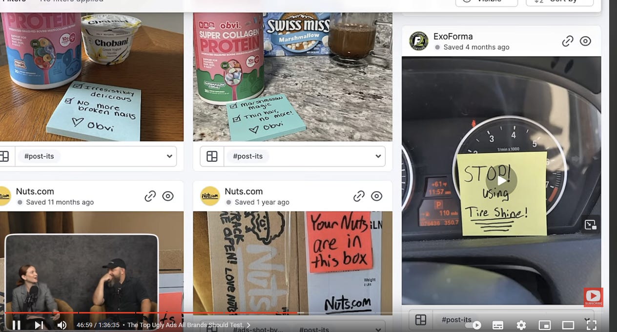
I bulletize a few highlights of the podcast, but there is much more to discover in the video:
Ugly ads are a great way to stand out from the competition. When everyone else is using polished, professional ads, your ugly ad will be sure to get noticed.
Ugly ads can be more effective than traditional ads. They can be more memorable and can create a stronger emotional connection with viewers.
Ugly ads can be more affordable than traditional ads. You don't need to spend a lot of money on production or design to create an effective ugly ad.
Dive deep into these pain points to identify the underlying issues and emotions that drive consumer behavior.
The goal is to strike a balance between understanding the consumer's pain points and maintaining a sense of authenticity and relatability.Film your ad like you are explaining the product to a friend. This is a great way to make your ad more relatable and authentic. It also helps to keep your ad concise and to the point.
Marketers who are constrained by cost caps may not always be able to create the most effective ads. This is because they may be forced to make compromises in terms of production quality, creativity, and targeting. Cost caps can limit the ability of marketers to experiment with new ideas and approaches.
Create a separate account for each client at TikTok and Instagram and watch especially organic content.
Barry Hott then gives an example of how he used Canva to create a video ad for a client. He said that he used Canva's voiceover library to find a pre-recorded voiceover that was perfect for the ad. He also changed the colors of the ad to match the client's branding.
When doing research for a brand, you can use AI to give you a good start. A good question to ask is “golden nuggets” or to use past tense, like “I was” or “I had” when analyzing reviews, to understand the problem and empathize more.
Create deep, deep empathy, rather than a brand focus. That what ugly ads are about. It’s not the customer, but don’t over-focus. You fail to grow to other customers. empathize with people who “could be my (or your) customers”.They also mentioned that advertisers should avoid focusing too narrowly on a single type of customer when creating their ad campaigns. This is because algorithms used by social media platforms and other ad networks may become too focused on showing your ads to people who closely resemble your target audience, which can lead to a lack of diversity in your audience and a decrease in the overall effectiveness of your campaign.
Breakdown data: spend per age for example, because it is often misaligned, relevance is not always click and buy, especially on Facebook.
In the video, they show ads via the tool:
https://www.foreplay.co, which is a huge ad library. Unfortunately, I do not have paid access, but it seems very valuable.
🤓Developer humor: the worst volume control in the world
Who says developers don’t have humor?
Back in 2017, a group of developers competed to make the world's worst volume control interface. I found most of the participant’s work and put it into a video.
Time for a laugh:
Thank you for reading,
Alex